XYPN Brand
XYPN Brand
// Brand Strategy + Identity + Visual Language System + Brand Collateral
XYPN empowers fee-only financial advisors to build the independent firm of their dreams with complete autonomy.
While much of the financial services industry relies on wealth as its standard by charging on a percentage of assets or investments, XYPN’s vision of subscription-based pricing opens up the world of financial planning to anyone. As a small fish with big dreams in the even bigger pond of the financial services industry, XYPN managed most of its first decade of existence on shoestring, rebel branding that had well outgrown its leather jacket.
As the idea of fee-only financial planning gained traction, it was time for XYPN to own their expertise.
“Growing up is hard to do.”

brand strategy
XYPN began as a movement of financial planners looking to change the industry. With a core purpose of helping people live their great lives, the team is passionate about transparency and inclusivity. Early marketing focused heavily on movement-driven language with a hint of rebellion. As the sole in-house designer, I worked with stakeholders across the company to define what moving into mainstream adoption looked like for XYPN.
Because XYPN had a base of fervent early adopters, it was crucial to create brand elements that built on that brand equity.
Shifting the brand towards approachable authority meant defining everything from the core target to the tagline. While much of the foundation of the strategic framework simply required documentation, the team needed a new approach for the way we talked about XYPN.
We began with a brand personality centered around the Magician archetype, a long-shot for a company catering to detail-oriented spreadsheet-lovers. Owning this personality differentiates XYPN in an industry of Sages, refocusing the leap of entrepreneurship to the magic of adventure. Built on a fresh brand promise, “Your business, your way,” the company’s first tagline became “Make it possible”—a testament to the brand that coaches, inspires, advocates, and most of all, empowers financial planners.


Identity
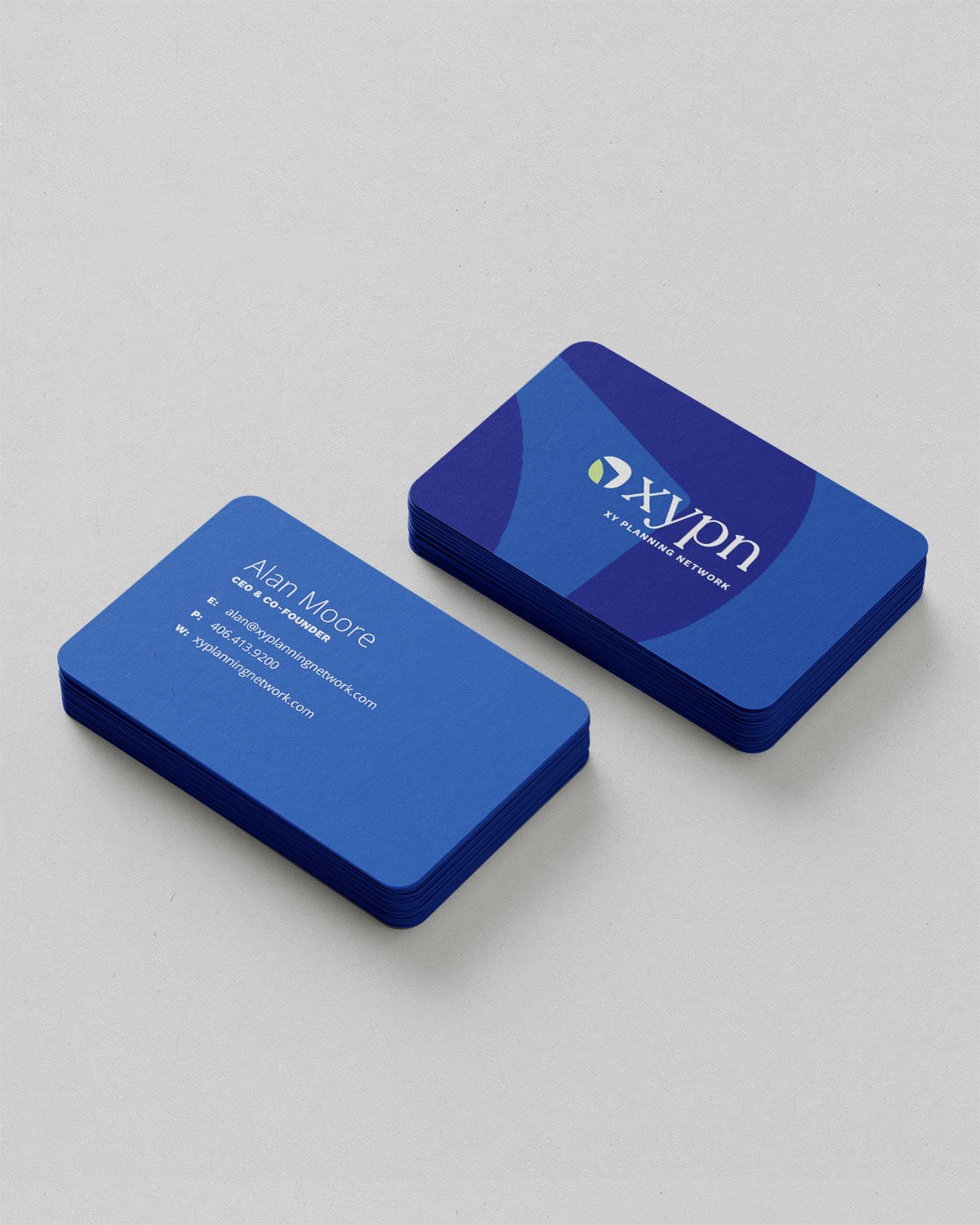
The XYPN combination logo was built on the Recoleta typeface along with an ownable logomark. I chose that wonky, playful serif for its deeply human feel. Standing out in a field of fintech sans serifs and institutionally traditional serifs, the type communicates approachable authority. The logomark brings a sense of movement, a hint of aspiration and inspiration in moving the industry forward.


XYPN required a whole product approach for its suite of back-office support services, annual conference, and podcast.


Visual Language System
The visual language system was built-by-brick, combining simplified elements years in use and entirely new visual vocabulary. The goal was to create a system that elevated XYPN without losing its humanity.
Color
Saying sayonara to the primary school hues, the updated palette brought a brightness and maturity to the brand. The founders’ attachment to a blue and green combo ran deep, so I prioritized a recognizable palette that leaned into trustworthy blue as the primary while using a fresh green as an accent.

Type
Recoleta is the primary display typeface, bringing a soft wonkiness that humanizes the brand in a sea of sans serifs. Work Sans is the secondary display typeface. The grotesque-inspired family combines modern polish with a friendly candor. Open Sans serves as the old reliable with a hint of the humanist.


Photography
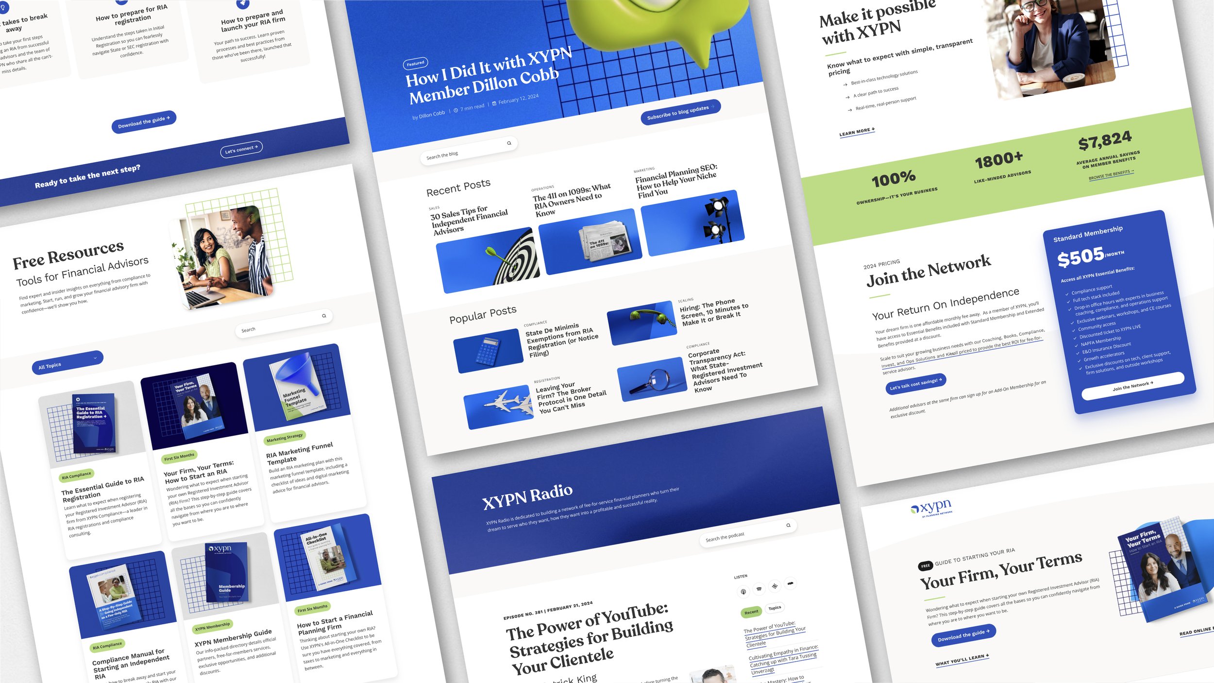
The photography style leans genuine, dependable, and conversational. Brightly lit, medium shots feature casual work environments, illustrating the dream of firm ownership rooted in confidence, authenticity, and individuality.


Style Guide
Because branding relies on its (many, typically non-design) practitioners, I also built out a style guide that outlined the visual building blocks of the brand. This included logo and graphic downloads, a click-to-copy color palette, basic typography training, and expansions on the graphic and photography styles.

Brand Collateral
For brand extensions big and small, we regularly returned to the concept of approachable authority. With a focus on empowerment, I featured faces whenever possible, shooting for a candid, honest style. From ebooks to podcast art, I updated countless assets for the updated brand launch. While consistency is crucial, each piece presents an opportunity to iterate.


For the website, we prioritized high-volume keywords through richer content, simple navigation, and custom dev work. With one designer/project manager, one part-time developer, and a timeline of about six months, we built a new website from top to bottom, customizing a HubSpot website template and managing multiple domain and platform transfers. We worked with the Marketing team and across the organization to publish XYPN’s first and second pillar pages, transfer hundreds of blogs and resources, and create a custom events blog that automates and scales for the team.

“Conversations with future members have shifted from ‘What is XYPN?’ to ‘How can XYPN help me start an RIA and what is included in the compliance offering?’”
Impact
With a fresh strategy, modern identity system, redesigned website, and countless new and updated brand collateral pieces, the brand is virtually unrecognizable from a year ago, much less its 2014 roots. In a six-month retrospective, the Marketing team saw major improvements:
Time on page increased 8%
Brand new contacts increased 17% while new contacts from organic traffic increased 9%
Marketing Qualified Leads increased 10% while Sales Qualified Leads increased 14%
Three new branded content campaigns resulting in 43,000 web sessions
