Baroque Impressions
Baroque Impressions Exhibit
// identity + environment
+ marketing + publication
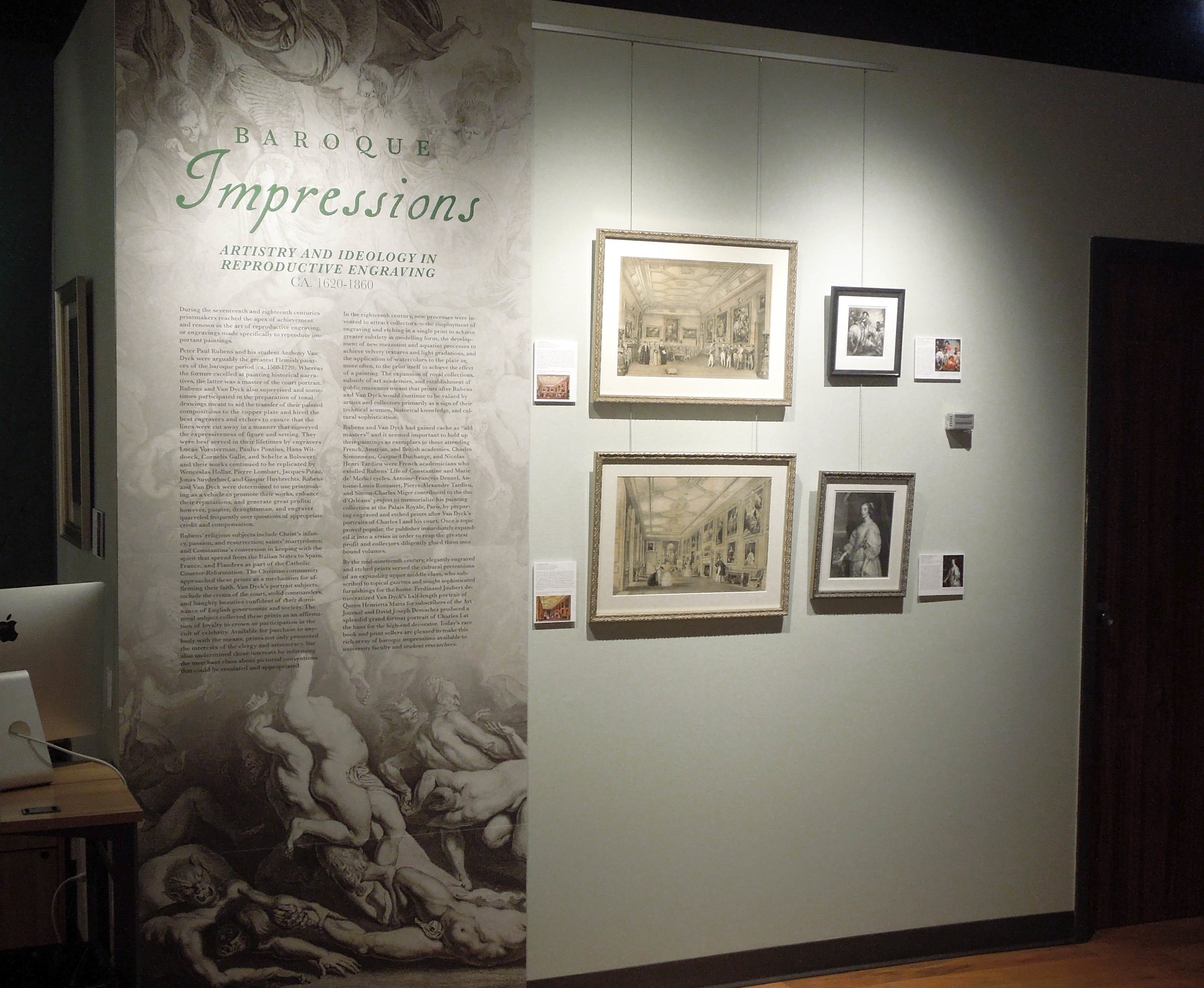
The exhibit Baroque Impressions: Artistry and Ideology in Reproductive Engravings featured reproductive prints after Rubens and Van Dyck from a number of artists. My role included original art historical research and writing as well as the entirety of the visual design—from identity and environment to marketing and the final catalog—all on a deadline of less than a month.
identity
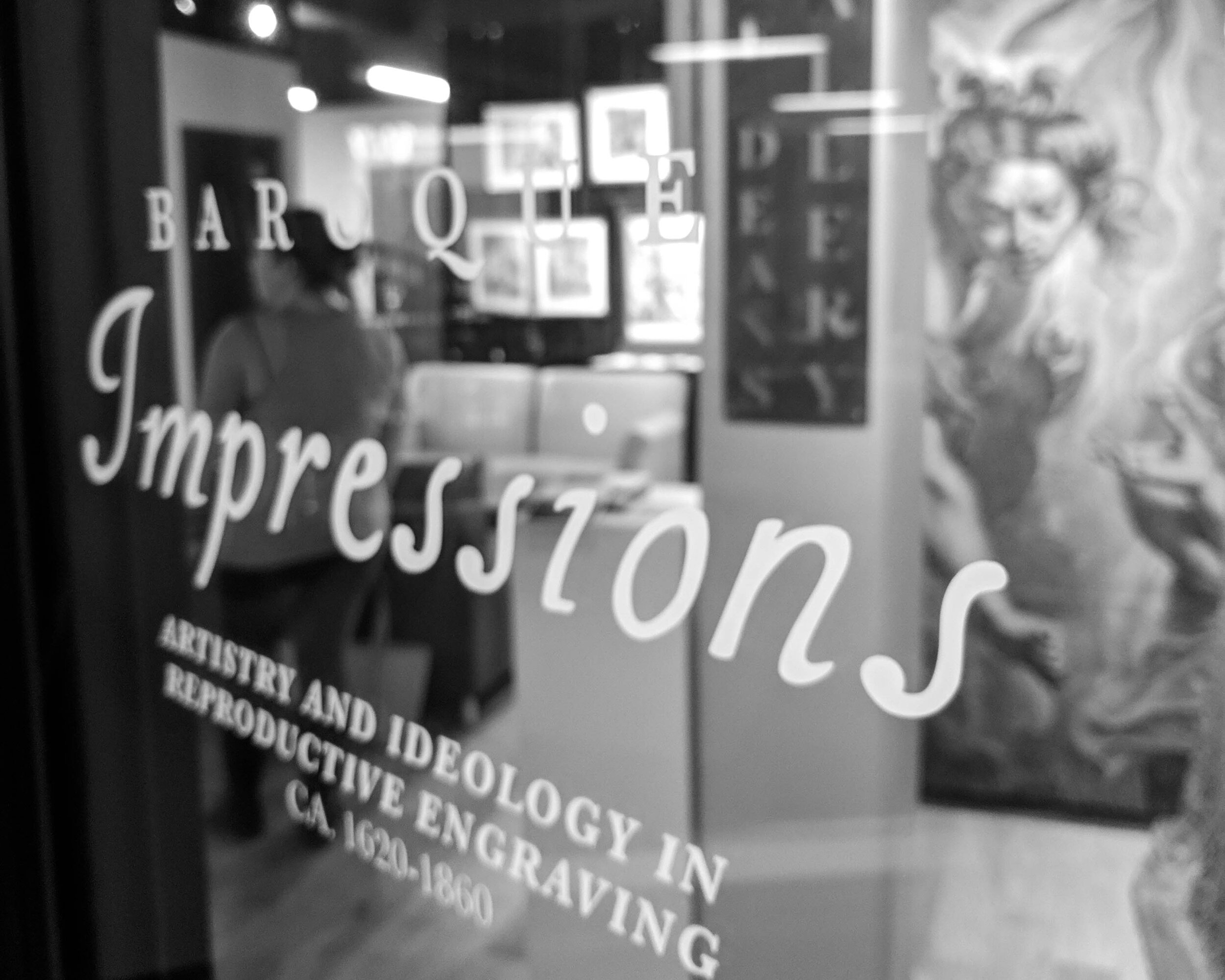
The typographic research for the identity began with type specimens from the sixteenth and seventeenth centuries. The final type choice speaks to both the Baroque period, but also to the exquisitely unique nature of reproductive prints, appropriately conveyed the contrasting nature of reproductive engravings as a cheaper, mass-produced facsimile which also serves as a work of art in its own right.
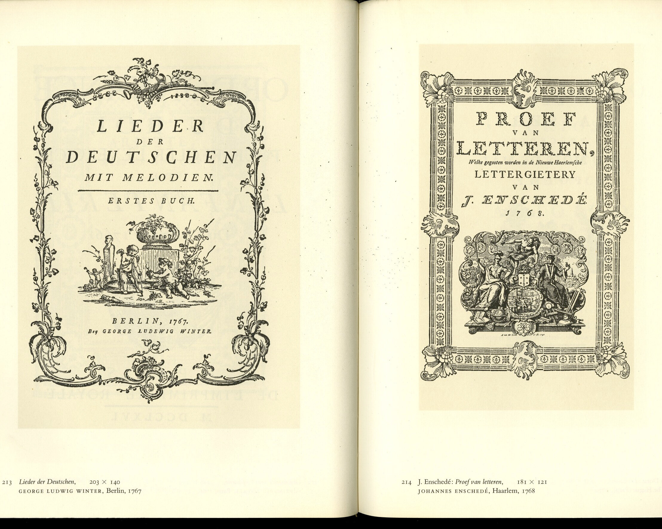
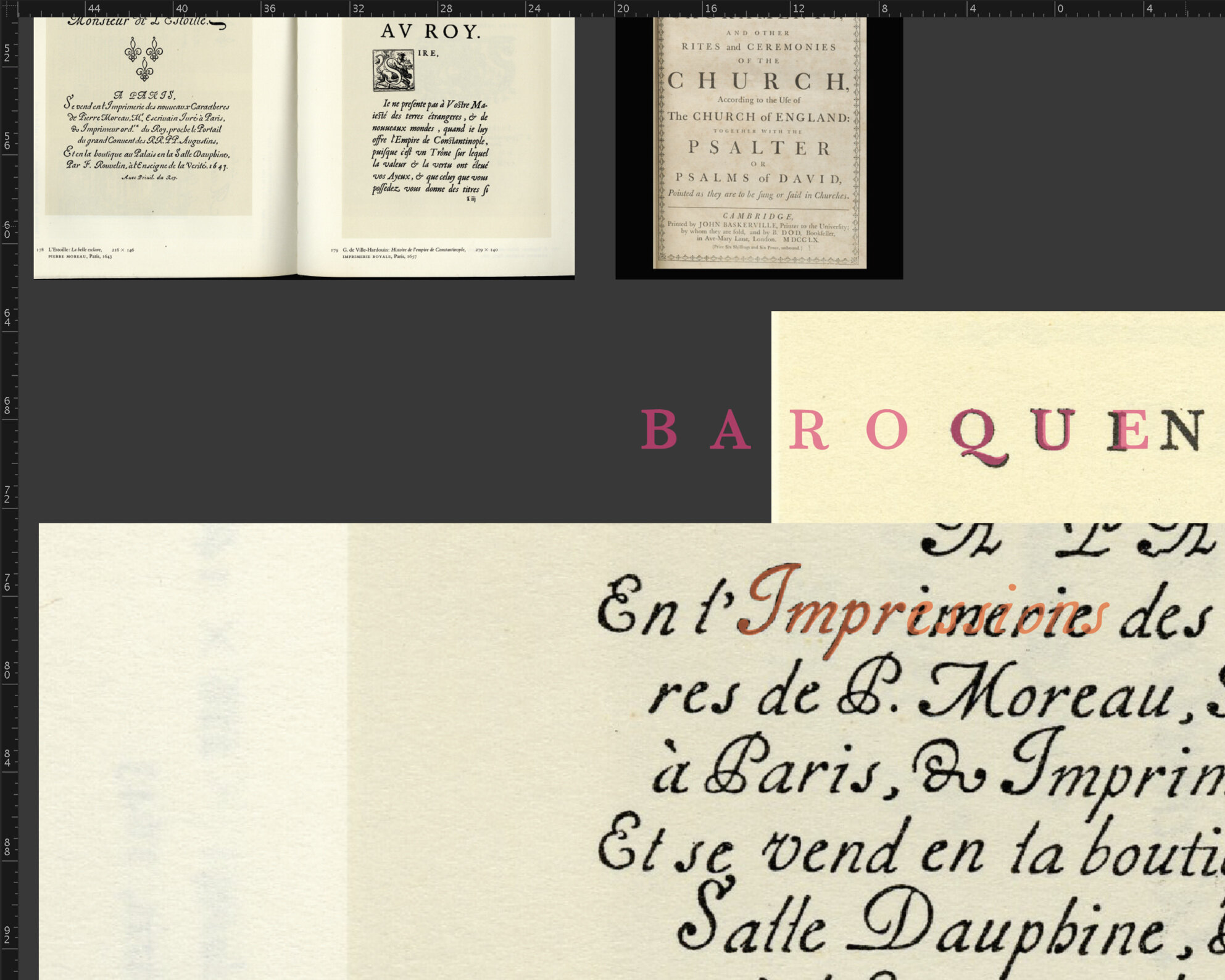
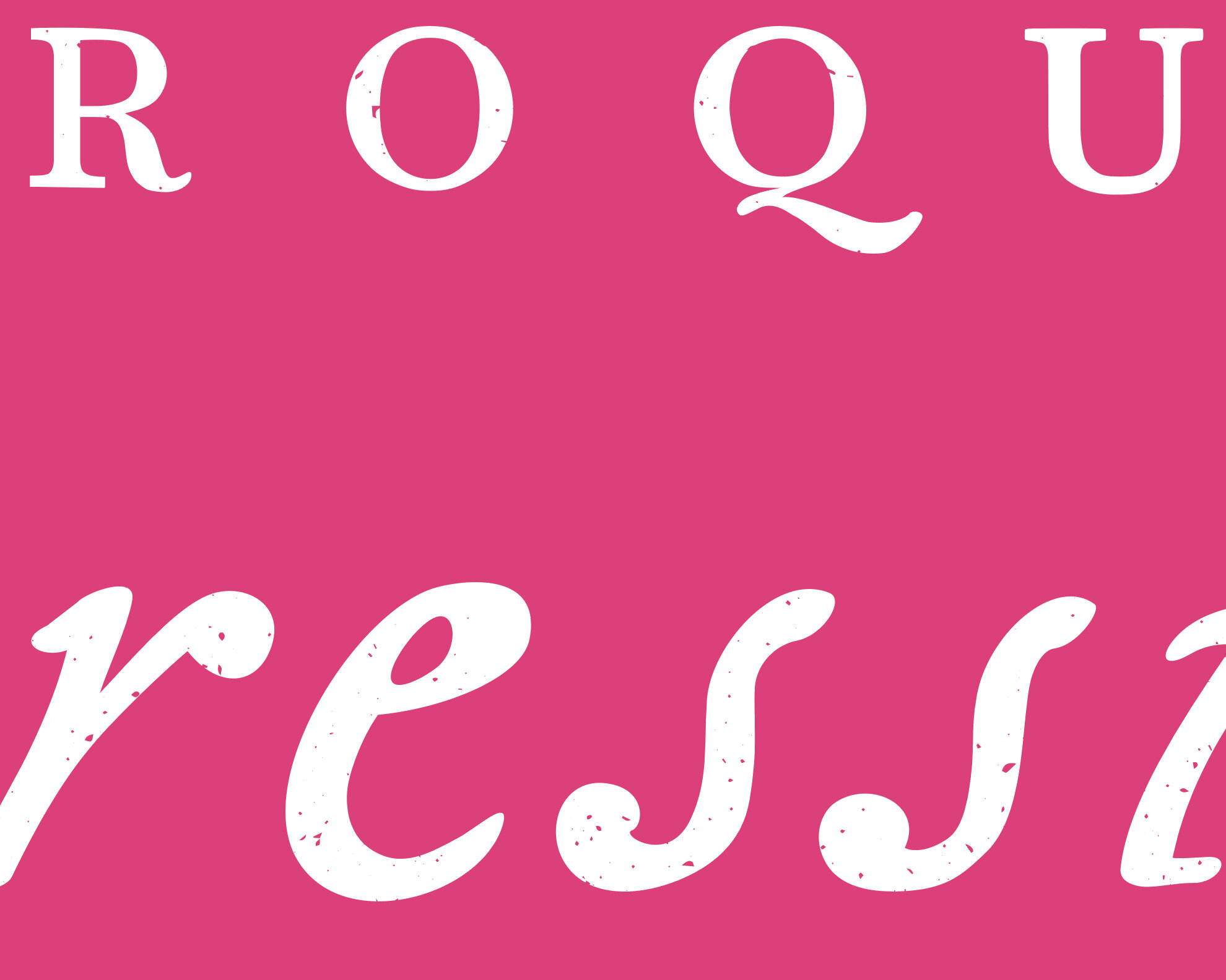
A small selection of process shots from the identity creation. After compiling more than forty type specimens from the period, I slowly culled down the examples until I found appropriately expressive examples – every single letter was individually drawn to reflect the nature of press printing in the era.
Environmental design
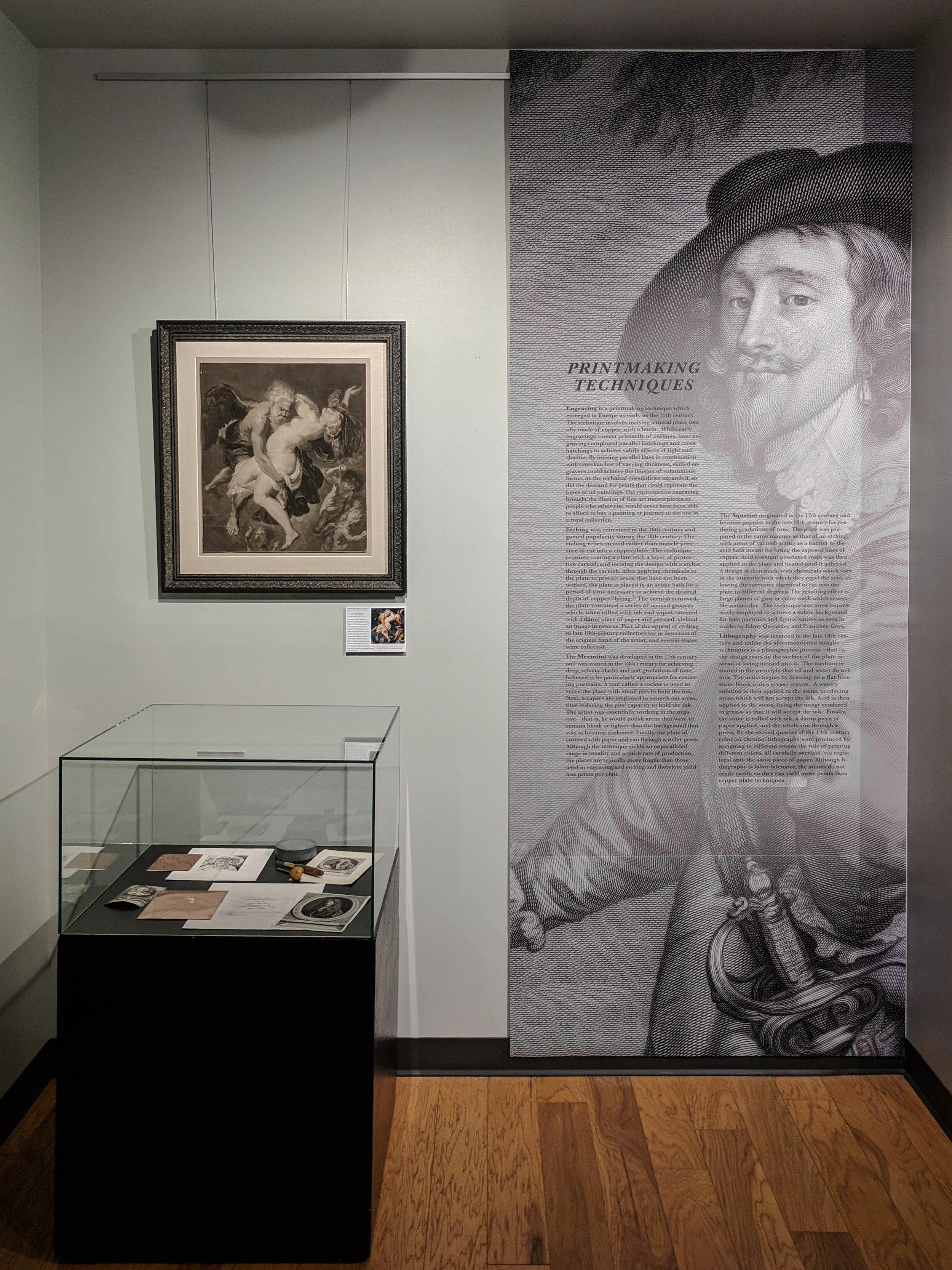
The exhibit featured details of prints to help draw attention to the minutiae for the casual passerby as well as individual labels which included the original painting for comparison. In addition to over 30 framed engravings, green damask walls and velvet curtains transformed the gallery into a cozy, Baroque gallery space that invited quiet contemplation.
Marketing Collateral
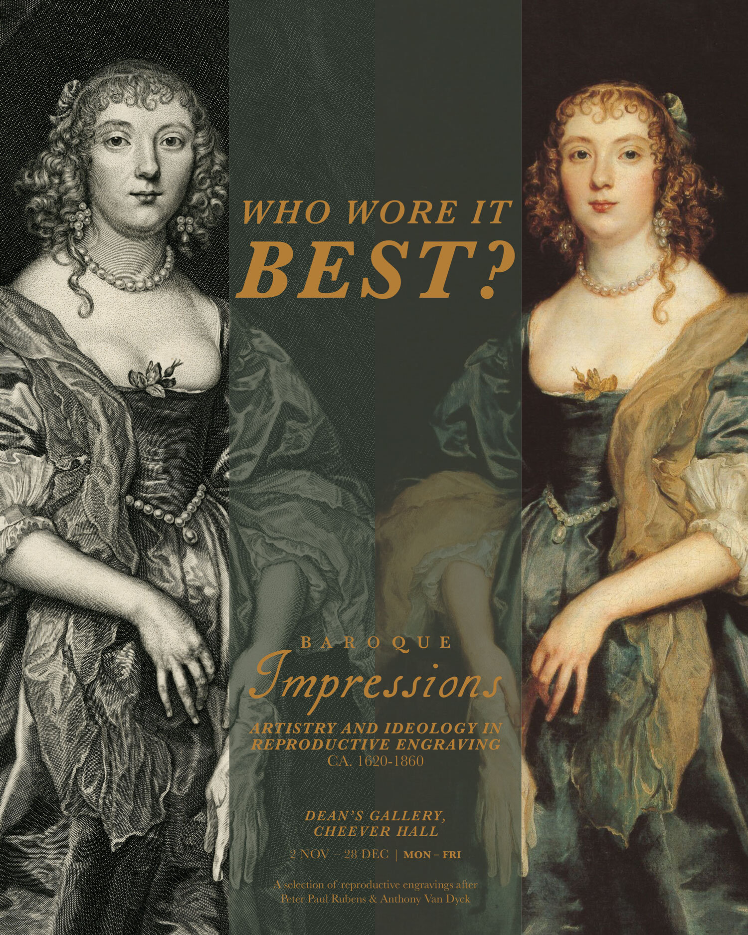
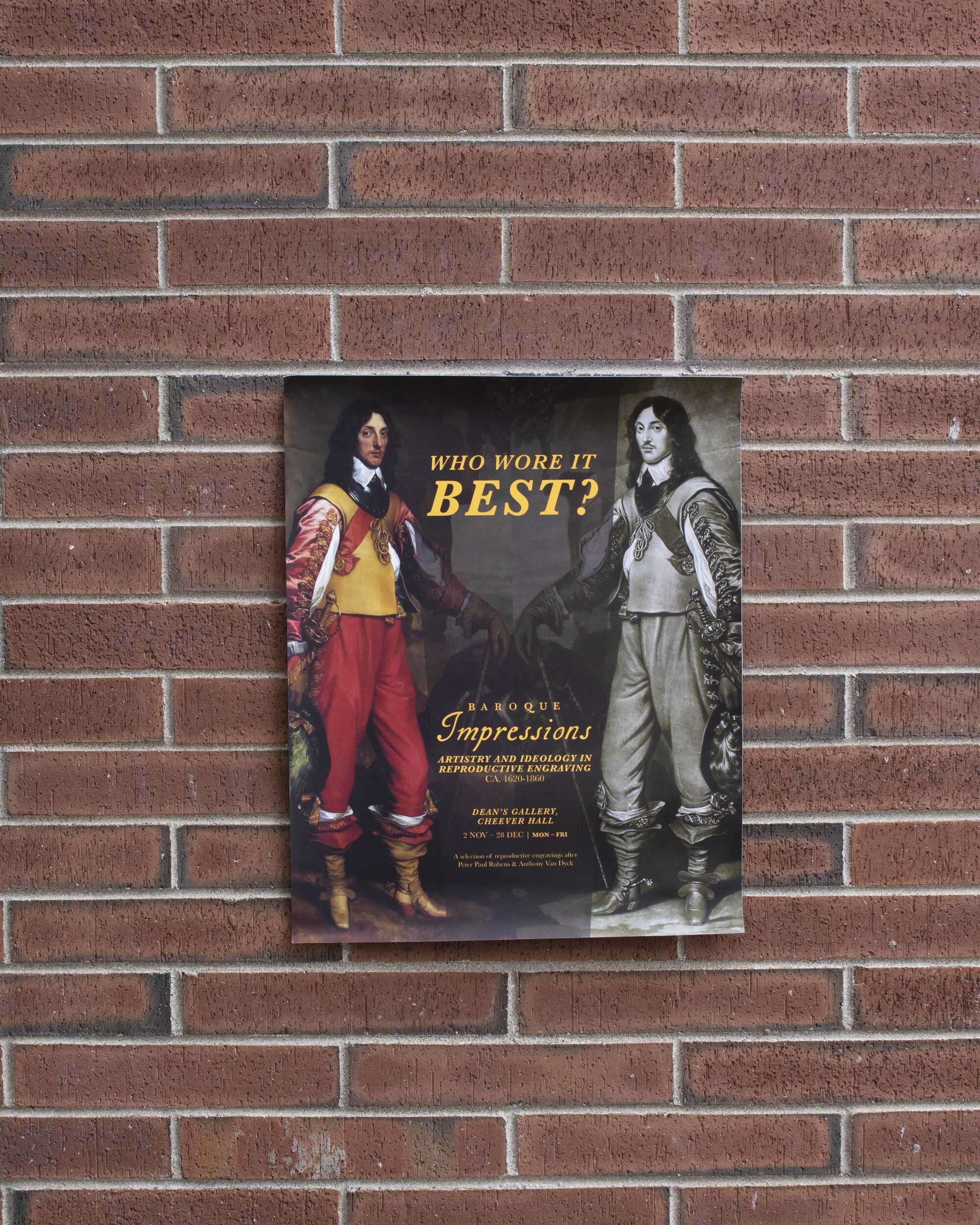
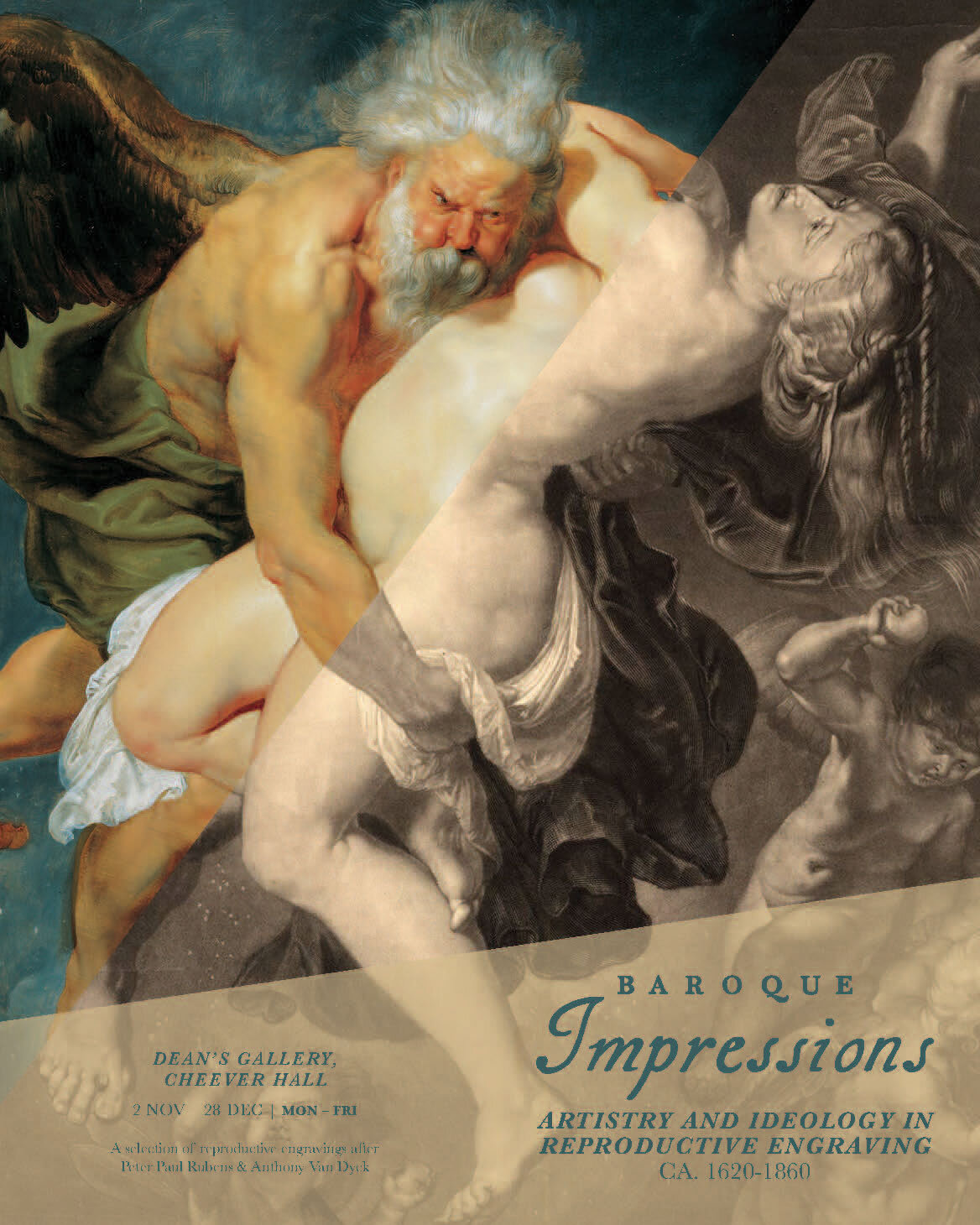
The marketing materials – including posters, postcards, social media imagery, digital signage, and invitations – needed to be both true to the original works and eye-catching to the modern viewer. To communicate the beauty in the reproduction, but also the originality and innovation of the engravers’ work, the design highlighted the contrast between painting and engraving. The final work took two directions: A split frame focused on the reproductive qualities for the artistic eye and a mirrored image which took a cheekier approach for a collegiate audience.
The final work took two directions: A split frame focused on the reproductive qualities for the artistic eye and a mirrored image which took a cheekier approach for a collegiate audience.
Publication design
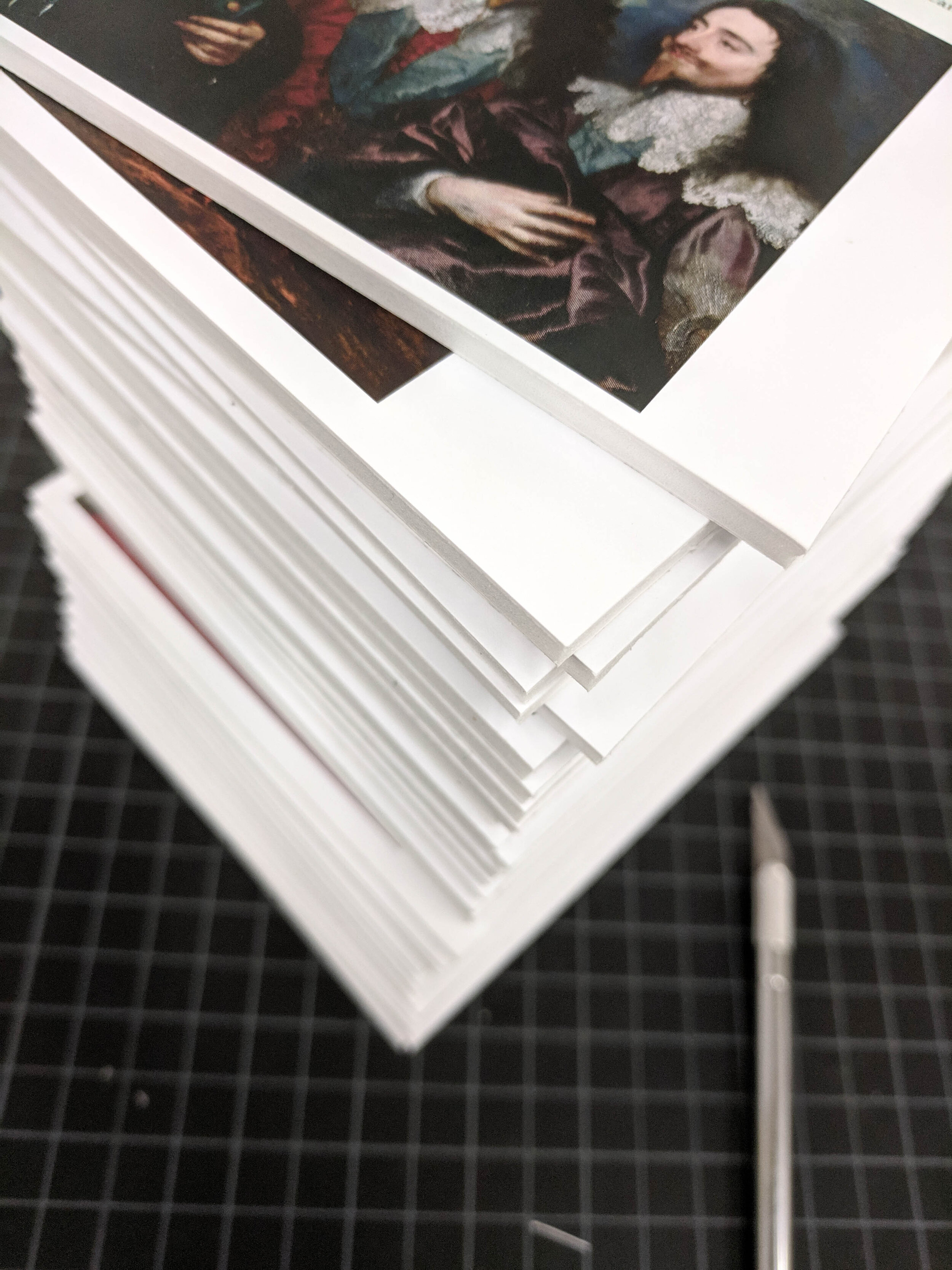
The 130-page catalog accompanying the exhibit featured original art historical research from six scholars (including me!) as well as several thematic essays. The production required documenting the 300-year-old prints, creating a flexible layout for articles of varying length, and a keen eye for detail page after page.
